Sunday, January 25, 2009
MAGIC IN EVERYDAY THINGS
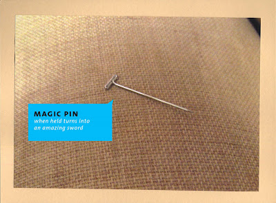
Magic is something that I really wish existed. Which is why i really wanted to explore this exercise. Life would be more entertaining if things had magical properties.These are some objects found at random around the Ringling design center.
Wednesday, January 21, 2009
IT HAS BEGUN
So, I read the book "How to be an Explorer of the World" cover to cover and considered many different options ( most of which did NOT involve being outside for long periods of time since it is ridiculously cold right now)! I think I reached a decision...insert drum roll. My first exploration will be #32, "World of Magic." There are actually many awesome things lying around if you just look for them, and since I am a total dork for anything with the title "magic" in it , that one sounded good to me. I really want to single out each item and make it appear more special by the composition and colors around it. We shall see how it turns out.
Friday, January 16, 2009
VIVA LA PROCESS
The best part of any project is the beginning. You've got a clean slate and haven't driven yourself crazy with endless possibilities of color, layout and execution. Every image in a design book looks like it would totally work and you day dream about how everyone is going to be blown away by your stuff and silently cry in the fetal position somewhere. However, there are always a few projects that will drive you slowly into madness only to give you insight in the perfect solution. And it is these projects that you remember the most, because they were born out of the toughest conditions and produced the most unlikely outcomes. All hail the process. Plus your just happy it looked good in the end period after all those hours of not sleeping and chugging Starbucks.
Dark Nature museum exhibit
This was the first project that I designed after interning at EA games in Orlando over the summer. As a User Interface design intern all I did all summer was create amazing photoshop and flash extravaganzas of football players running with manly ribbons trailing. So you can image having an assignment that meant dealing with type AND image was almost an entirely new concept to me. The first round of this project I was waaaay too literal in my execution, there was nothing about it that said ME at all, and that is something that is very important to every designer.to have a personalized voice. The second go around I thought about different abstract ways to interrupt the project and ended up with something I am really proud of.
Gate 28 magazine
This magazine made me want to punch a baby in the face. The project guidelines were to do as follows: To design a magazine geared towards adventurous traveling young adults and at the same time juxaposing a completely different abstract idea that somehow merged with traveling. The teacher for whatever reason was totally cool with the first group of students doing "extreme sports" as their juxapose, however once it was our turn the bar was raised a little higher. I decided on spirituality/surfing/traveling the globe. Mother of God. Long story short the more research I did on invididual countries and their religions/culture the easier the design work got! Seriously it really pays to just get away from the software and do some old school research on what you are designing.
Reincarnation calender
The basis behind this design was that it had to be an unconvential calender that tracked something other then dates. At the time I made this I was really fascinated by the Tibetian religion of reincarnation. There were all these levels and stages you had to go through just to reach enlightenment and each level was like something out of Lord of the Rings. I decided to make the calender cylindrical to mirror the never ending cycle of death and rebirth. The research was so fun for this one.
Subscribe to:
Posts (Atom)